I attended a Facebook Virtual Portfolio Event yesterday, October 14.
Disclaimer: Most of the information I learned from this workshop is mostly Product Design-driven, so everything I mention here may not apply to your chosen field!
This is how the hour-long meeting was run (I pulled this from the email we were sent the day of so we all knew what to expect):
5 min: Welcome to the Virtual Portfolio Workshop
10 min: University Recruiting will give brief presentation
45 min: Break out into small groups where a FB Product Designer will give an interactive walkthrough of a sample portfolio. This portion is meant to be interactive so please feel free to ask the designer any questions on what they look for in a portfolio.
The Welcome part was okay; they sent us a Kahoot link and then we typed up the schools we were from. It was a bit intimidating to see people from big schools such as SCAD, RISD, Rochester University, Cornell, and some others that I can’t really remember.
University Recruiting Presentation
The University Recruiting presentation was really helpful since it was 2 University recruiters from Facebook who were giving first hand tips on what they’re looking for when they’re recruiting for positions. I took screenshots of their presentation to reference for myself, but I realize it’s good to share here on the blog too.
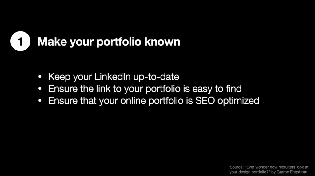
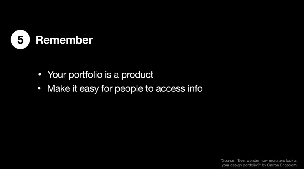
They told us that the first place they will look is your Linked-In profile, which is why they highly encourage to keep it updated. They will try to find your portfolio here and if they can’t find it on your profile, they will do a Google Search. I know for me, there are many Courtney Lee’s out there and my site will not come up. For other people, this may not be the case, but still, keep your portfolio link visible on your Linked-In!
SEO stands for Search Engine Optimization; the recruiters said you can control this with some meta-tags (I think) but I’ll need to look into this part more. If anyone has info on that let me know!
Recruiters specifically were asking for interactive portions of the portfolio. I’m wondering if this is a trend throughout the industry or just something these particular recruiters were looking for.
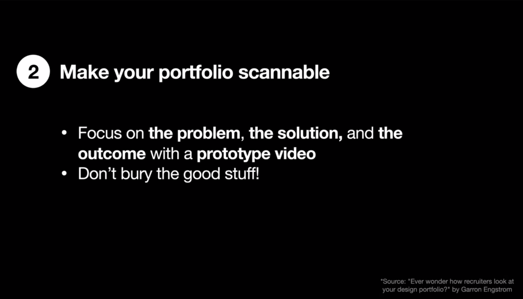
One thing that I didn’t hear before was the recommendation to have a prototype at the very top. In addition to this, they also suggested that instead of making your prototype clickable, make it animated and play on its own so that way they can see what it does without needing to click on it directly.
It was really helpful to hear this piece of advice because the recruiters are the ones who will pass your information to the managers so knowing that they look for this is extremely helpful.
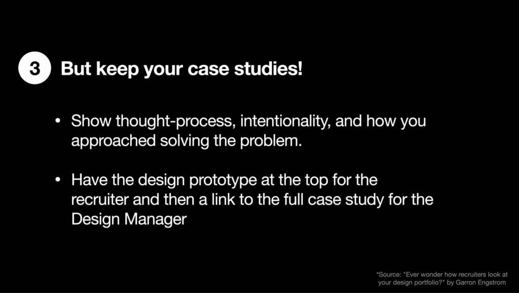
I just mentioned some of this already, but I have heard countless times how important it is to show your process. They highly suggest creating a summary at the top that tells the user (in this case the recruiter or any other outsider) what the problem, solution, and outcome is.
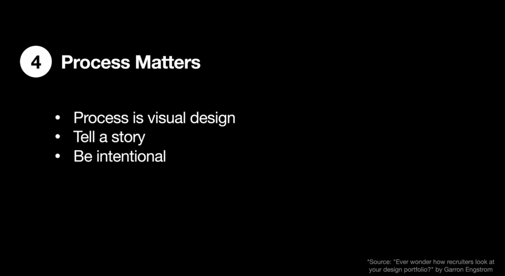
The best way to interpret this slide is to think about yourself and how you want to represent you in your portfolio; it should be personal and unique to you.
45 minute Portfolio review with Facebook Product Designer
After this presentation, we were all broken up into breakout rooms with a product designer from Facebook. In my group, there were 13 other students with me.
The product designer I was with is named Lhelya. She was really nice and told us a little about herself. She went to school in Chile and majored in advertising and minored in graphic design. Later she came to the U.S to study again and after working at Salesforce and some other companies, she began working at Facebook. (I found her on Linked-In and connected with her after the session!) I thought it was nice of her to tell us a bit about herself and she was going to ask us to go around and introduce ourselves, skipped it because of time.
The portfolio we spent most of our time on was http://kathleen-huang.com/
Kathleen is another product designer at Facebook. For the landing page, Lhelya liked that her homepage had easy access to her work, about me, and resume. She said that the drawing shows an appreciation for aesthetics.
When we clicked on her work, it brings you down the page instead of to a new page. Lhelya liked the hover part of the grid where you can hover and then see some info about the work. She had asked us if there was anything we would do differently and I spoke up and said that I would have given a small prompt telling what problem that was being solved in each particular project.
With the grid system as a whole, Lhelya critiqued that there was a lack of contrast. She thought that it was difficult to read the tag-line on the hover. She also thought that the visuals for each project she be more consistent; for her project 3 & 4, she liked that the USA Today project was framed nicely in the app whereas the grocery AR app were wireframes. In addition to this, each project shows the product except the Amazon project just shows a logo of Amazon…she thought this was inconsistent with the other graphics being shown.
We got to the bottom and saw the “Upside Down” literally, illustrated upside down. We weren’t sure what it was, but she was intrigued by it (I just checked and it’s a good idea…she put other work in there that’s she done that’s for fun!)
Next, we chose the state of transit piece to review. The piece was good in that it showed the product up front on the landing page. However, Lheyla thought that the context of the product wasn’t clear and she recommended that we set the context of our projects from the very beginning because the rest of the process would is tldr.
The project didn’t clearly state what the problem was, the goal of the project, and what the outcome was from the start. When looking at the final product, there was only one high fidelity prototype and Lheyla said she would have liked to see more. Moreover, she wanted to know what the outcome of the project was: Was it a success? Is there anything you would have done differently? If it wasn’t a success, why not?
There was one more portfolio that we looked at, but I was unable to note who’s it was due to the limited time we had left. She did note on this particular portfolio the about page and said that she likes to know in this page what the individual’s current experience is, where they are in design (are they employed, are they looking for a job, etc).
Overall, I found this portfolio review to be helpful; I liked that we got to interact and talk to a real product designer at Facebook and see their thought process. I feel like this experience was great because I got industry advice on little things to help my portfolio stand out and that can make a huge difference in my chances of landing a job!